Tron Legacy Website Design

Design Role
TRON: LEGACY WEBSITE DESIGN
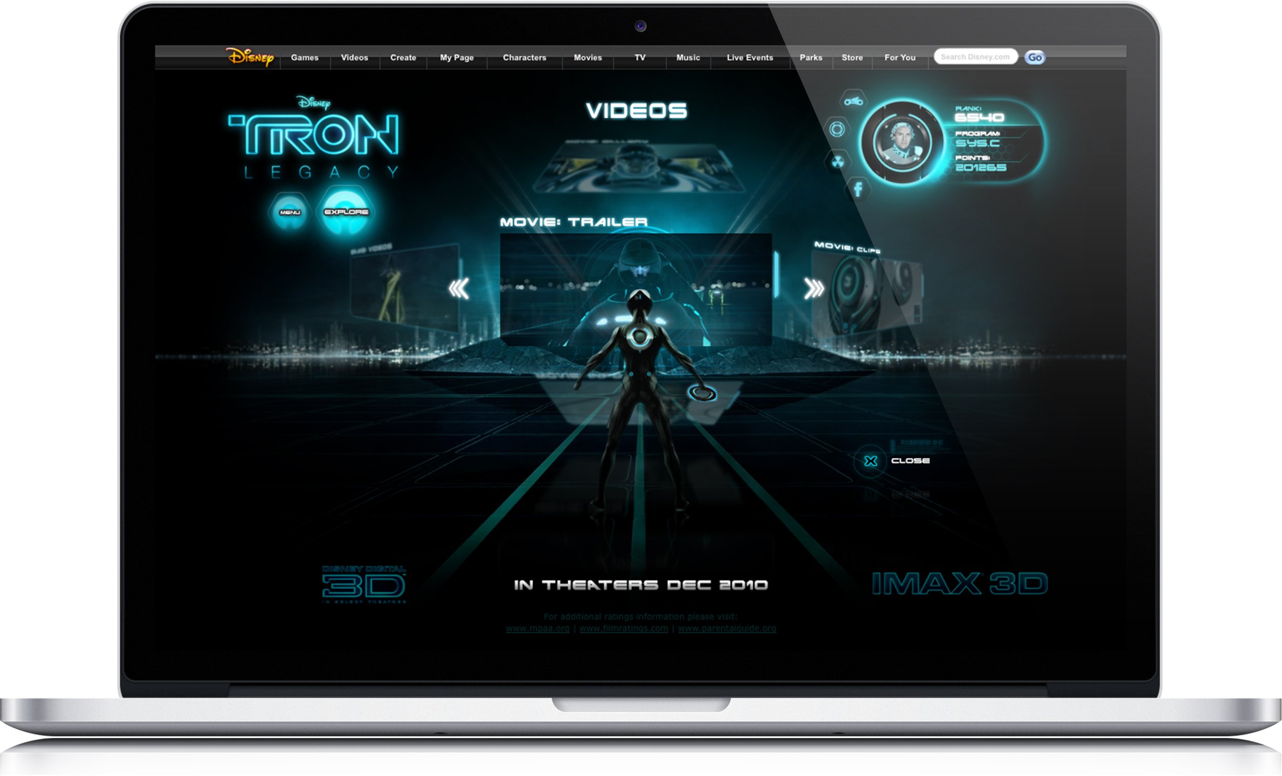
I had the great opportunity to help design the flash based website for Disney’s Tron: Legacy movie. I tag teamed the creative with a fellow design colleague at Threshold Interactive. My role was to design the UI elements including the side dropdown navigation menu component, the avatar module, the interactive map and the light cycle carousel feature. The styling of the elements were designed based off of key art we received from Disney to fit the production design and art direction of the film.
Execution
Main Navigation
When a visitor had entered the site, they were led to a landing page with a left hand main navigation that allowed them to go straight to content. I designed this scalable menu, so sub-content selections dynamically load out from the side of the main content selections to allow for potential content additions for future growth of the franchise.
Tron Legacy scalable navigation menu
UI Sub Navigation
Once a section such as “Videos” was selected from the main navigation menu, it took users to the main content section for that specific item where billboards such as “Movie: Trailer” or “Movie: clips” could be browsed by scrolling horizontally either left to right or right to left. Once a sub content section like “Movie: clips” was chosen, a user’s scroll would shift from left to right to vertical to browse the various clips such as “Visual Effects Test Footage” or “Concept Video”. This was designed to lend a more dynamic and compelling user experience and also to allow for an infinite amount of additions to subcategory content as time goes on.
“Program Mode” UI Sub Navigation
Navigating the site content in “Explore” mode button mirrored the action packed, adrenaline charged experience of controlling and riding on a light cycle. Upon entering the site for the first time, visitors recieved a message asking if they “are a user or a program”. If a visitor chose “program” they were prompted to register and walked through steps to create their avatar program. In this mode seen below with the “explore” button highlighted, users would navigate the site riding a light cycle.
MINIMIZED IDENTITY DISK
When a user is exploring the site, their avatar was minimized into the upper right hand corner of the site like a widget. Showing the users thumbnail image within the identity disc, as well as their name, stats and ranking. To the sides of the identity disc were 4 UI buttons/icons that would change light cycles, connect with facebook, show member achievements as well as reward systems.
“Explore” mode button enabled, allowing users to explore site on a light cycle
Light Cycle Carousel
A visitor who chose “Program” upon entering the site were prompted to register and create their own avatar program similar to in the movie. Once a user had customized their avatar and determined their program type they were given an option to choose there light cycle in a carousel display I designed below. Users could also change their light cycle by clicking on the UI button next to their minimized identity disc.
Light Cycle Carousel Selector Design
Network Grid Light Cycle Exploration Map
In explore mode the user could now explore the site using their “Program” avatar by riding through the site to explore new content and destinations guided by a network map I designed. When signed in through Facebook connect, the user could also see their friend’s “program” moving on their map as well.
Map design in explore mode


