Cracked iPad Reader App
Challenge
Following the highly acclaimed and positively received Cracked website redesign, the company was motivated to update the remainder of their existing product line. The first item on the agenda was the iPad Reader App, which aimed to provide users with a more streamlined experience compared to the website version. As we embarked on the design process, we encountered several key challenges: How could we modernize the outdated app? How could we enhance the user experience for iPad users? How could we incorporate sponsorship opportunities without compromising the user experience?
KEY ISSUES
Modernize the outdated version of the Cracked iPad app
Create a better user experience through design
Create placements for sponsorship opportunities
Integrate Native Ads
Solution
To achieve this, I led the effort of redesigning the Cracked native iPad iOS Reader application. Since this came project came after the completion of the website redesign, we were going to use the newly created design system as guide for the overall look and feel of the new iPad Reader. This would give the brand a cohesive and contemporary look across all of its product offerings. We would also create branding opportunities on the splash page and integrate ads into the content which would give brands incentive to sponsor the app without negatively effecting the overall user experience for the fans.
Execution
Sponsorship Opportunity Creation
HIGH IMPACT PLACEMENT
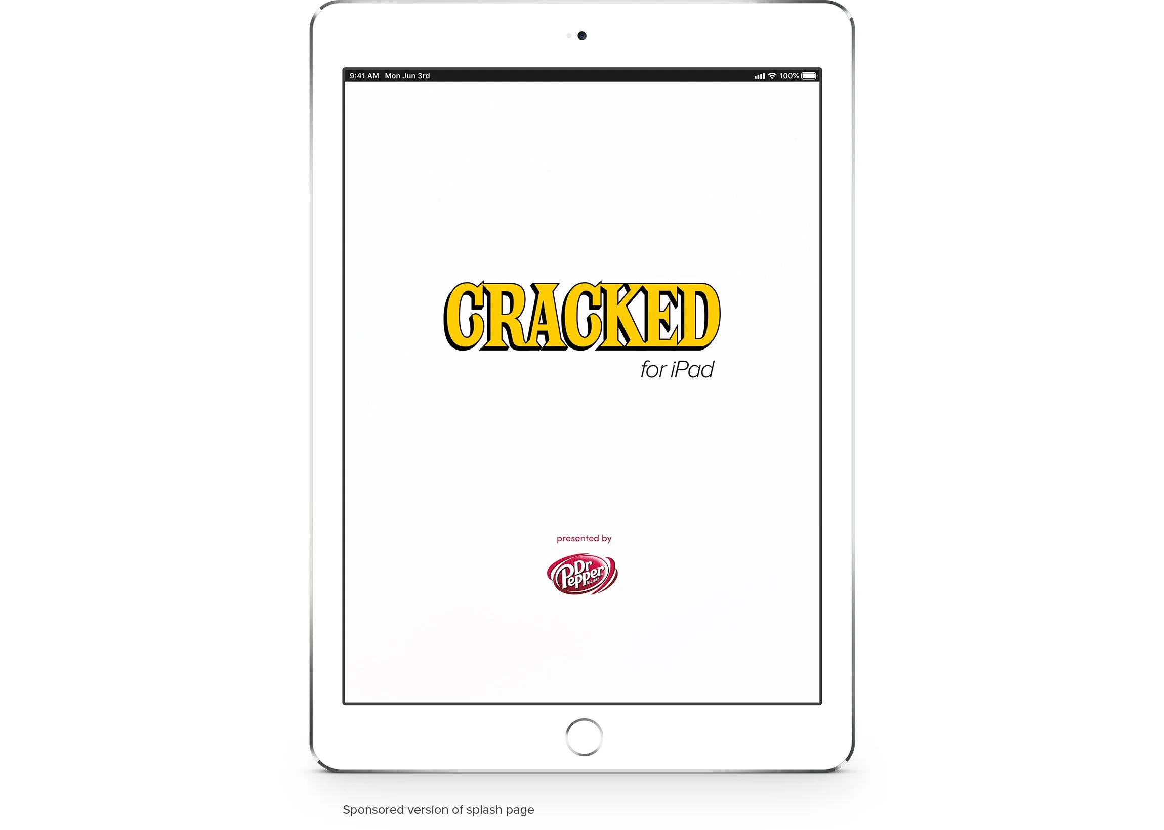
When users first open the app, the splash page is the first thing they see. So we created a high impact placement here for paid sponsors to showcase there brand logo in a way that wouldn’t conflict with the Cracked logo. Also making the background color white ( it previously was red ) made the sponsor logo standout as one of the first things users see when the app was opened.
Integrated Native Ad Placements
SPONSORED CONTENT
Native Ads were an integral piece of Cracked’s business strategy. We integrated these into our iPad Reader app to give users a seamless experience. While we had many different types of Native Ads, the most common ones featured on our iPad Reader app were sponsored articles. The most important aspect of native ads are that they look like standard pieces of content, so users won’t ignore them. But in fact, they are custom pieces of content written by our editorial staff promoted by a paid sponsored. Below highlighted in red are some examples of native ad placements we used on our article homepage and how the sponsored content would look like as a piece of content on the article detail page.
Modernizing the App
UI/UX MODERNIZATION
In an effort to modernize the app, I approached the iPad redesign similarly to the website redesign. By applying the design system from the website and following Apple's Human Interface Guidelines, I devised a design strategy for a cohesive look across both platforms. To achieve this, we utilized a standard UI card pattern with large images, ample white space, and typography consistent with the recent web redesign.
One decision made by stakeholders was to extend the content titles, allowing up to 100 characters for more creative headlines. However, this presented a challenge in fitting all the information neatly on tablet screens. To address this, we slightly reduced the padding around the title text fields and made the typeface slightly smaller.
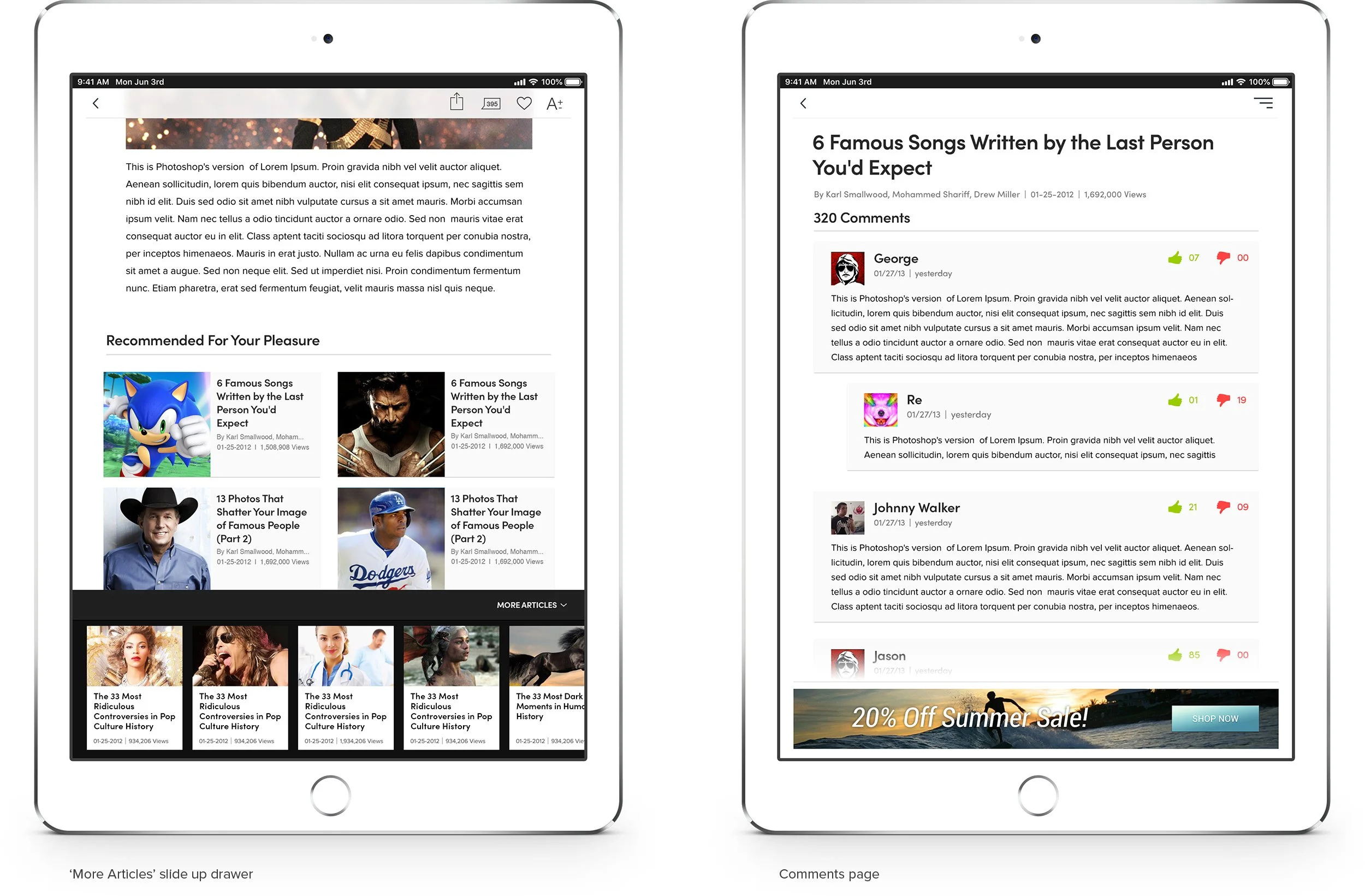
From a UX perspective, the previous app had several pain points, with site navigation being the most significant. Users had to return to the home screen to access different sections of the app. To improve accessibility and content discovery, we introduced a side navigation drawer component. Additionally, we enhanced the app's UX by implementing a dedicated comments section, enabling users to interact by replying and voting on comments. This increased engagement and encouraged users to log in to participate. We also made content sharing easier by adding functionality to copy content links, share via email, and through social media. Lastly, we included a font resize button on the article page to assist users who had difficulty reading smaller text.
IMPROVEMENTS TO UX
Side navigation drawer for more efficient content discover and accessibility
Added dedicated comment section
Made content sharing easier and more robust
Font resize button
Custom UI Icons
CUSTOMIZED EXPERIENCE
Custom icons were designed for each section of the app to enhance visual differentiation in the side drawer navigation component.
Conclusion
Results
The Cracked iPad Reader App garnered significant attention from corporate sponsors, including renowned brands such as Old Spice, M&M's, and Epic Stride Gum. Additionally, popular TV shows and movies like Breaking Bad, Grownups, AMC's 'Immortalized,' and Fox's 'New Girl' sponsored the app. These partnerships not only brought valuable support but also added to the app's appeal and relevance.
In addition to attracting prestigious corporate sponsors and achieving high download numbers, we also prioritized enhancing the user experience of the Cracked iPad Reader App. We achieved this through several key improvements:
Modernized Look: We overhauled the app's design to provide a more contemporary and visually appealing interface. By implementing the latest design trends and employing a sleek, intuitive layout, we created a modern look that captivated users and aligned with their expectations.
Enhanced Accessibility: We focused on improving accessibility features to ensure that all users, regardless of their abilities, could easily navigate and engage with the app. This involved incorporating accessibility guidelines and features such as adjustable font sizes, color contrast enhancements, and support for screen readers, making the app more inclusive and user-friendly.
Improved Usability: We conducted extensive user research to identify pain points and areas for improvement. Based on user feedback, we refined the app's navigation, streamlined content discovery, and optimized interactions, resulting in a more seamless and intuitive user experience. By simplifying complex processes and reducing friction points, users were able to effortlessly browse and enjoy the app's content.
These enhancements collectively contributed to a more engaging and enjoyable experience for users, fostering higher satisfaction and increased usage of the Cracked iPad Reader App.


